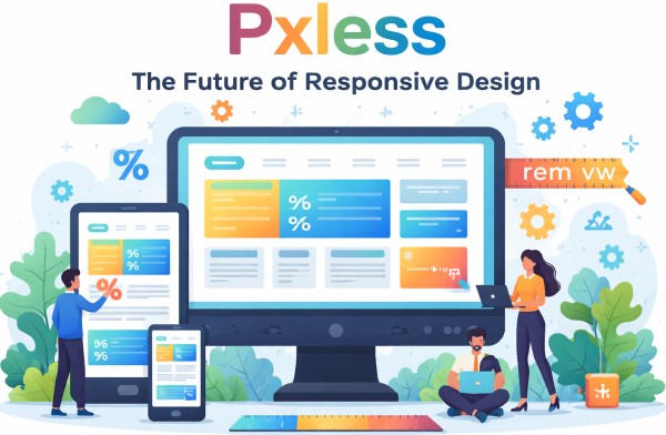
Introduction to Pxless Design
In the modern digital world, where users access websites and applications across a wide range of devices, achieving a consistent and seamless experience is critical. Traditionally, designers relied heavily on pixels to define layout dimensions, font sizes, and spacing. However, the concept of pxless design is rapidly changing the way digital interfaces are created. Pxless, short for “pixel-less,” encourages designers to move away from rigid pixel-based layouts and adopt flexible, scalable units that respond dynamically to various screen sizes.
This approach not only ensures better visual consistency but also enhances accessibility, usability, and future-proofing of digital products. In this article, we will explore the pxless methodology in depth, its advantages, practical applications, and why it is becoming a necessity for modern web and app design.
What Does Pxless Mean?
Understanding the Concept
Pxless is an innovative design philosophy that minimises the reliance on fixed pixel values (px) in digital layouts. Instead of defining exact pixel dimensions, pxless design utilises relative units such as em, rem, %, vw, and vh. These units allow elements to scale proportionally with the viewport or user settings, creating a fluid and adaptive interface.
For example, rather than specifying a button width as 200px, a pxless approach would define it as 50% of the parent container or 10vw relative to the viewport. This subtle shift can dramatically improve responsiveness and ensure that designs remain consistent across multiple devices.
Why Pixels Are Limiting
Fixed pixels may work well for static screens, but in today’s multi-device environment, they can create several challenges:
-
Poor responsiveness: Fixed pixel layouts often break on smaller screens, causing horizontal scrolling or misaligned elements.
-
Accessibility issues: Users who need larger text or zoomed-in views may experience layout problems.
-
Time-consuming adjustments: Designers and developers must create multiple layouts for different breakpoints, increasing project complexity.
Pxless aims to solve these challenges by embracing flexible design units and a user-centric approach.
Advantages of Pxless Design
Enhanced Responsiveness
The most apparent benefit of pxless design is enhanced responsiveness. By using scalable units, websites and applications adjust naturally to different screen sizes. Whether viewed on a smartphone, tablet, desktop, or ultra-wide monitor, pxless layouts maintain proportionality and avoid awkward spacing issues.
Improved Accessibility
Accessibility is a core principle of modern digital design. Pxless supports accessibility by allowing text, images, and UI components to scale based on user preferences or device settings. This ensures that users with visual impairments or different screen resolutions have an optimal experience without breaking the layout.
Simplified Development
Implementing pxless design can streamline development processes. Developers spend less time writing multiple CSS breakpoints and creating separate style sheets for various screen sizes. Instead, a single scalable design system can adapt across devices, reducing coding effort and maintenance costs.
Future-Proof Designs
Digital devices are evolving rapidly, with new screen resolutions and form factors emerging regularly. Pxless designs are inherently more adaptable, making them future-proof. Designers can focus on creating flexible layouts that work seamlessly on devices yet to be released.
Key Units in Pxless Design
Relative Units
Em and Rem
-
Em: Relative to the font size of the parent element.
-
Rem: Relative to the root element’s font size.
These units allow text and container sizes to scale proportionally, maintaining readability and visual balance across devices.
Percentages (%)
Percentages define element sizes relative to their parent container. This ensures flexible layouts that adjust automatically when the parent element changes dimensions.
Viewport Units (VW & VH)
-
VW (viewport width): 1vw equals 1% of the viewport’s width.
-
VH (viewport height): 1vh equals 1% of the viewport’s height.
Viewport units are particularly useful for hero sections, full-screen images, and other elements that should occupy a proportion of the screen regardless of resolution.
Practical Applications of Pxless
Responsive Web Design
Pxless is ideal for creating responsive websites. Designers can define layouts that scale naturally across devices without relying on numerous media queries. For example, a navigation menu can use relative units to adjust its size based on the screen width, ensuring it remains functional and aesthetically pleasing on all devices.
Mobile-First Design
Mobile-first design focuses on prioritising smaller screens before scaling up to desktops. Pxless complements this approach by enabling elements to scale fluidly, reducing the need for complex calculations and breakpoints.
Scalable Typography
Typography is a critical component of user experience. Using relative units like em and rem ensures that font sizes scale proportionally with other elements, maintaining readability and consistency across different devices.
Adaptive UI Components
Buttons, cards, forms, and other UI components can benefit from pxless design. By defining dimensions in relative units, developers can create components that maintain their proportions while adapting to different screen sizes.
Implementing Pxless Design
Evaluate Existing Layouts
The first step in adopting pxless design is to assess current layouts. Identify areas where fixed pixels are used excessively and consider replacing them with relative units.
Define a Scalable Typography System
Establish a typography scale using rem or em. This ensures that all text sizes scale consistently and remain accessible.
Use Flexible Containers
Replace fixed-width containers with percentage-based widths or viewport units. This allows content to adapt to different screen sizes without breaking the layout.
Test Across Devices
Pxless design requires thorough testing. Check how layouts perform on mobile, tablet, and desktop screens, adjusting relative units as needed to ensure a seamless experience.
Adopt a Design System
Using a pxless design system standardises scalable units across all elements, making it easier for teams to maintain consistency and efficiency in large projects.
Challenges of Pxless Design
While pxless design offers many benefits, it also comes with some challenges:
-
Learning curve: Designers and developers accustomed to pixel-based layouts may need time to adapt.
-
Precision control: Pixel-perfect alignment can be harder to achieve, which may concern traditional designers.
-
Browser inconsistencies: Older browsers may interpret relative units differently, requiring additional testing.
Despite these challenges, the advantages of pxless far outweigh the drawbacks, particularly for modern responsive and adaptive designs.
Future of Pxless
Pxless design is more than just a trend; it represents the future of digital design. As devices continue to diversify and user expectations rise, designers must prioritise flexibility, accessibility, and scalability. Pxless offers a practical methodology to meet these demands, ensuring that digital experiences remain consistent, user-friendly, and visually appealing.
The adoption of pxless design is likely to grow, influencing not only web development but also mobile apps, wearable interfaces, and even emerging technologies like augmented reality and virtual reality. Designers who embrace pxless principles now will be better prepared for the next generation of digital experiences.
Conclusion
Pxless design marks a significant shift in how digital interfaces are created. By reducing reliance on fixed pixels and embracing relative, scalable units, designers can build responsive, accessible, and future-proof layouts. From improved user experiences to simplified development processes, the benefits of pxless are clear.
In a world where digital devices are constantly evolving, pxless design offers a robust, adaptable, and efficient approach. Whether you are a web designer, developer, or digital strategist, understanding and implementing pxless principles is essential to stay ahead in the competitive landscape of modern digital design.